
Pattern Play: How to Mix Patterns
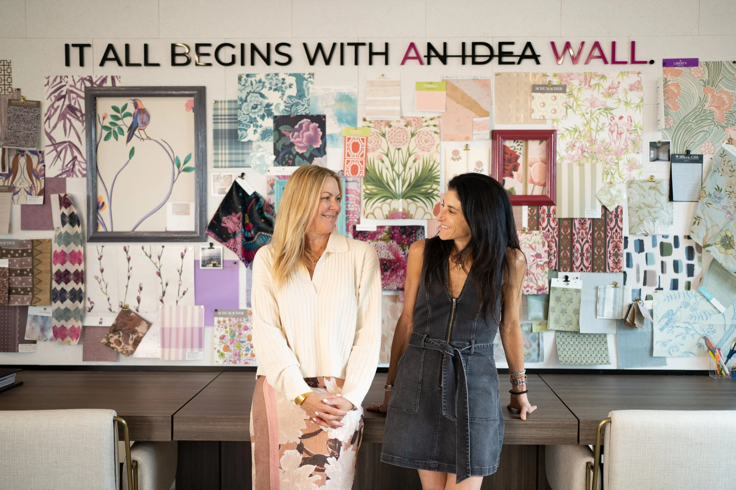
Most clients walk into Talking Walls with the same quiet question: “Can I really mix patterns without it feeling like too much?”And, to be honest, I get it.
Pattern play looks effortless in a magazine spread, but in your own home, it can feel like a high-stakes decision. And here’s what I see every day in the showroom: people are drawn to patterns because they make a room feel alive, but they worry about getting it wrong.
So let’s lower the pressure. The difference between “too much” and “just right” is usually a couple of easy adjustments. Once you know what to look for, mixing wallpaper with wallpaper and wallpaper with fabric starts to feel natural rather than intimidating.
1. Start with one pattern that sets the tone
Begin with a “lead” pattern you truly love. That is your anchor, the piece that sets the mood for the whole space. In most rooms, it’s the wall covering because it covers the largest surface. But sometimes the lead is a standout fabric, especially if your walls are quieter or more textural, such as grasscloth or a soft, tonal paper. Starting with a clear lead gives the room direction and makes every subsequent choice easier to evaluate. You are not trying to make everything match. You are building a story around one strong point of view.
2. Scale is the real secret
Color gets the spotlight, but scale is what makes a mix feel balanced. When two patterns are the same size and have the same contrast level, they compete. When they are clearly different in scale, your eye knows how to read the room. Mixing a bold, large-scale pattern with smaller motifs keeps a space interesting without feeling overwhelming.
A simple formula we use constantly is a three-part rhythm:
Large scale: your statement wallpaper or a big-motif fabric.
Medium scale: a secondary wallpaper, drapery, or upholstery with presence.
Small scale: accents like pillows, chair seats, trims, or petite prints.
3. Mix pattern types for contrast, not confusion
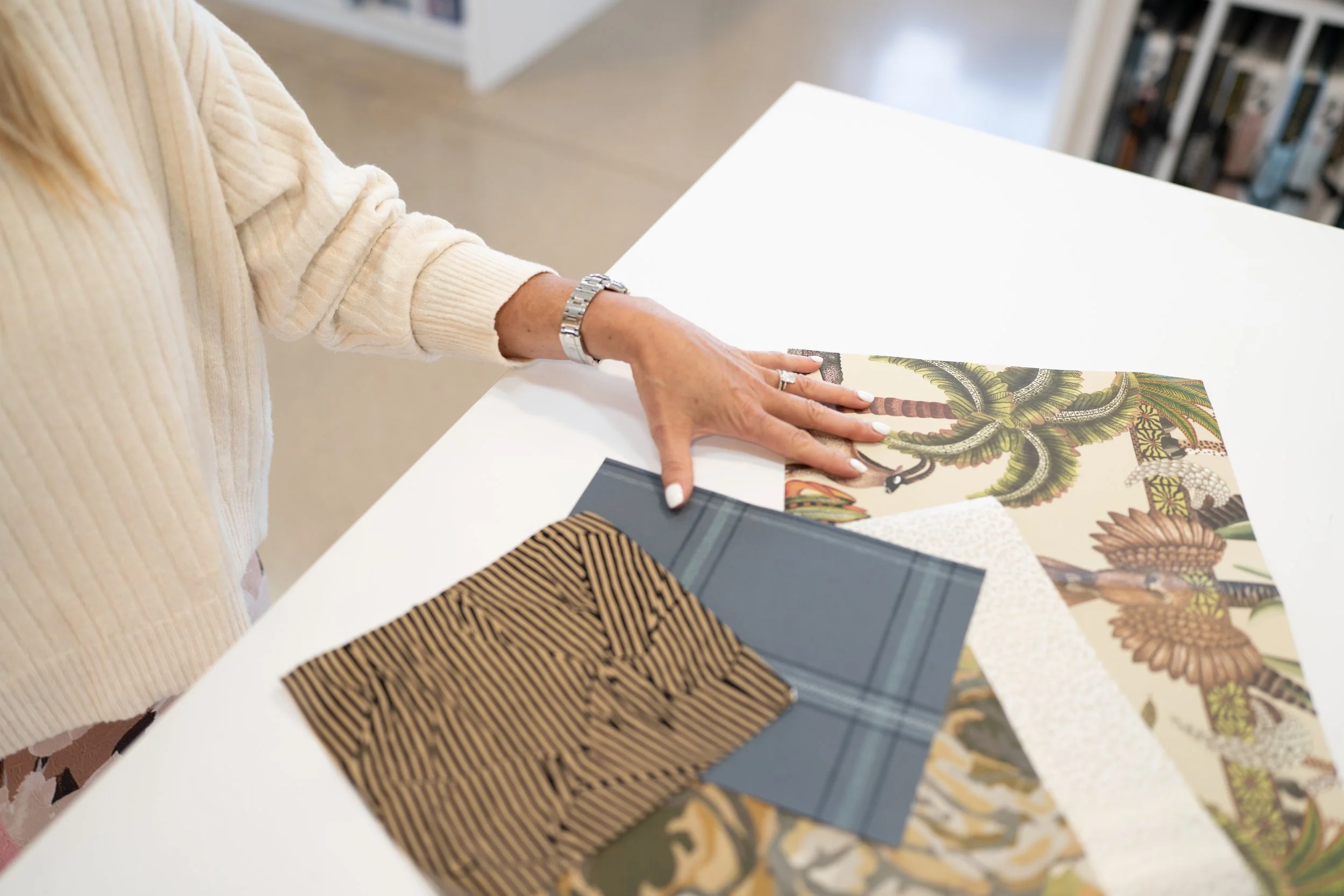
Once scale is working, variety in pattern type adds depth. Pair organic shapes with structured ones. Mix graphic with painterly. Blend classic motifs with something more modern. Contrast is what makes a space feel layered instead of themed.
Examples that almost always work:
Bold floral wallpaper with a tailored stripe or grid fabric.
Geometric wallpaper with a softer, irregular fabric like an ikat or watercolor print.
Mural-style paper with a quiet check or a tone-on-tone weave.
If a mix feels off, it is usually because the patterns are too similar in both scale and personality. Adjust one of those variables, and the room tends to click back into place.
4. Let color connect the dots
Start with a multicolor pattern and pull a few of those tones into your other choices. You don’t need to match every shade. Rooms feel more collected when colors relate but are not identical. Repeat one or two key colors in multiple places, then let supporting tones show up more quietly. Add solid or near-solid fabrics to give your eye a place to rest.
Color should feel like a through-line, not a strict rule.
5. Wallpaper with wallpaper: think neighbor, not twin
Two wallpapers in one space can be stunning when they feel related, not identical. The goal is connection with contrast.
Best pairings include:
A bold focal wallpaper with a quieter companion. For example, a large botanical on the main wall paired with a small-scale stripe or subtle geometric pattern nearby.
One pattern with one texture. For example, grasscloth, linen looks, or tonal designs add depth without adding more noise.
Avoid two papers that share the same scale and the same contrast. That is where rooms start to feel visually loud, even if each paper is gorgeous on its own.
6. Wallpaper with fabric: decide who speaks first
If your wallpaper is the lead, fabrics should support it.
Bold wallpaper: keep large fabric areas calmer, like sofas and drapery, then bring pattern back through smaller accents.
Subtle wallpaper: let fabric carry more of the drama, especially on drapery or upholstery.
Stripes are a reliable helper here. They create structure and pair easily with florals, geometrics, and abstracts. When you want the room to feel pulled together, a well-scaled stripe often gives everything else a clear framework.
7. Small rooms can handle pattern, if you balance it
Patterns aren’t only for big spaces. Smaller rooms often feel more dynamic and finished with pattern, as long as scale stays balanced and you include a few calmer surfaces to offset it. Powder rooms, breakfast nooks, hallways, and laundry rooms are perfect places to try this, because the payoff is big and the commitment is contained.
The Talking Walls way to make this easy
You don’t need to be a maximalist to mix patterns. You just need a plan:
Choose a lead wallpaper you love.
Add a second pattern in a clearly different scale.
Finish with a small-scale print or a texture.
Let color tie everything together.
Step back and check that the patterns feel distinct, not competitive.
If your gut says “too much,” it is almost always a tweak of scale or contrast away from “just right.” That isn’t a taste problem. It is a simple adjustment. And once you see how those adjustments work, pattern play stops feeling risky and becomes the fun part.
From the editor

If there’s one thing I’ve learned from years of watching people fall in love with patterns, it’s this: your instinct is usually better than you think. The hesitation comes from not knowing how to organize what you’re already drawn to. Once you start paying attention to scale, contrast, and a clear color thread, the whole process feels lighter and a lot more fun.
Pattern has a way of making a room feel like someone lives there, not just decorates there. So trust what you love, give it a little structure, and let your walls and fabrics tell the story of your home. And if you want a second set of eyes, that’s what we’re here for. Come visit us at Talking Walls. We'd love to see what you’re working on.